The “Lines” of a typeface
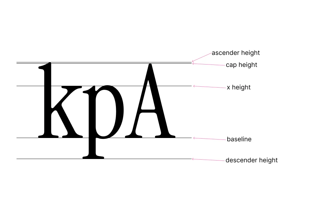
Ever seen those diagrams of an in-process typeface design with a bunch of horizontal lines? Here’s a nifty diagram and description of those lines.

- Baseline - The line upon which most letters sit, which serves as the reference line for most characters.
- X Height - The height of lowercase letters like “x,” which is the distance between the baseline and the top of most lowercase letters (without ascenders or descenders).
- Cap Height - The height of uppercase letters, such as “A,” measured from the baseline to the top of the capital letter.
- Ascender height - The height of parts of lowercase letters that extend above the x-height (like the top of “k”).
- Descender height - The part of lowercase letters that extend below the baseline, such as the bottom portion of “p.”
There are a few other lines that may appear, but these are the important commonly used ones.
 Last modified:
  Last modified: