Typography Terms

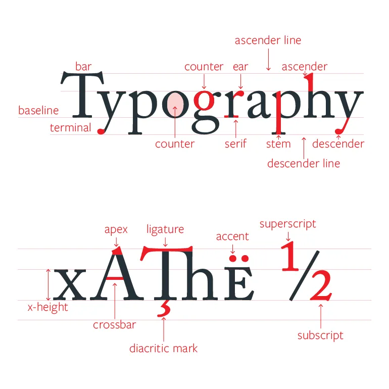
Typeface- refers to a an overarching/overall design of characters. For example, Arial or Times New Roman are typefaces.Font- refers to a specific style, weight, and size within a typeface. For instance, Arial Bold 12pt is a font, whereas Arial is the typeface. The files that define a typeface are also typically referred to as “Font” files as well.Glyph- a specific visual representation of a character in a typeface. This refersd to the actual shape, design, look of just one character. For example, uppercase “A” and lowercase “a” are two different glyphs.Ligature- a ligature combines two or more characters into a single glyph. These are often used to improve the visual flow of a typeface, avoid awkward spacing, etc. For example, “a” and “e” combined into “æ”.Hinting- Hinting is a process used in typography to allow fonts to be more legible when rendered at small point sizes on small screens. AKA, in the font itself you can encode some info about how to render a font at small point or screen sizes, and this will be used by rasterizers.Side Bearing- This refers to the space on the left and right of an individual glyph. Each glyph has a left side bearing and a right side bearing. Side bearings are set consistently for each character, and usually defer to some kind of logic/pattern in the font.Kerning- Kerning refers to the adjustment of spacing between specific combinations of characters to improve visual harmony. For example, “A” and “V” next to eachother would leave a lot of open space, so kerning is required to adjust this combo in a font. Kerning generally overrides side bearings.leading- pronounced “ledding”, refers to line height/space betwen lines in a multi-line block of text.measure- refers to the length of a line of textContextual AlternatesFractionsExtrema-TODOUPM-TODO
 Last modified:
  Last modified: