What makes a font?
These are the characteristics that make up a font, differentiating it from calligraphy or handwriting.
Construction
The “construction” of a font is like the skeleton, the structure of the underlying strokes that makes up a glyph.
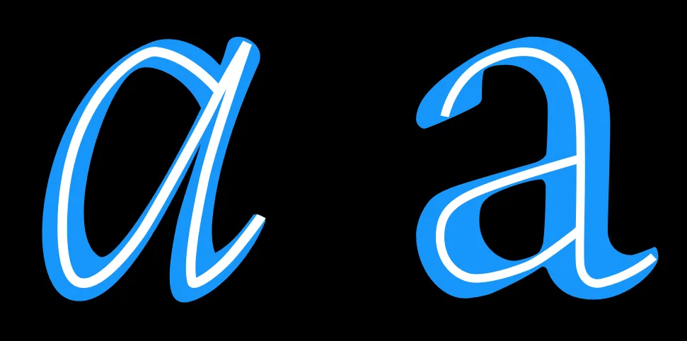
However, the way strokes in a font end (the ‘terminals’) and the ‘serifs’ (see below) are not part of what is meant by ‘construction.’
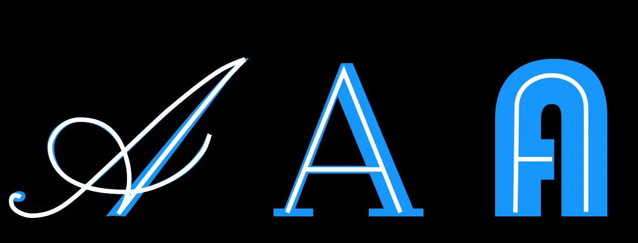
Construction is the skeleton of the glyph, while the rest — width, weight, terminals — are all parts of the flesh.
Proportion of X-height to Cap-height
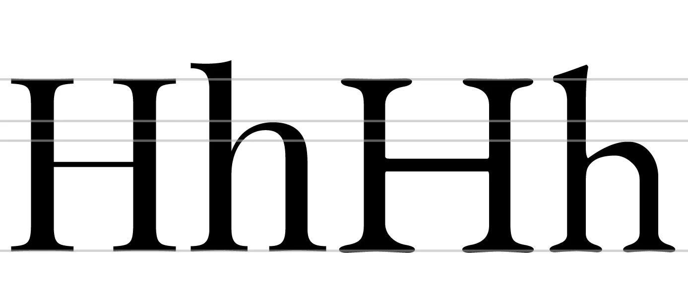
The x-height is like the horizontally-running center line of a font. In the example above, the font on the left is from Playfair Display. The letters on the right come from EB Garamond.
Playfair Display has a high x-height in proportion to it’s cap height, whereas EB Garamond has a smaller x-height
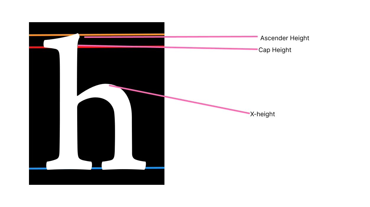
Ascender Height
Ascender heigt refers to stuff that exceeds the cap height by a little bit. In some cases, however, they can match or even be lower than the cap-height. They’re like the little doo-dads on top of H’s.
Longer ascenders can add elegance to the look of a typeface. They often go with smaller x-height.
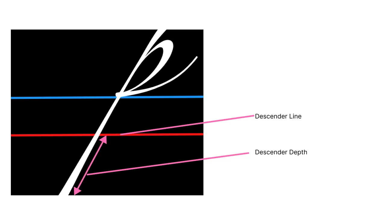
Descender depth
Descenders are stuff that go below the descender line, marked below. Letters with descenders like p, q, g, etc. go below the descender line. Like ascenders, descenders that are long can feel elegant.
Width, Weight, Slant
All self explanatory but also make up “what makes a font”.
width- the footprint of the glyph, how much space it takes up.weight- the stroke width, basicallyslant- italicness
Contrast
Contrast specifically refers to the variation in the stroke width of glyphs in a font.
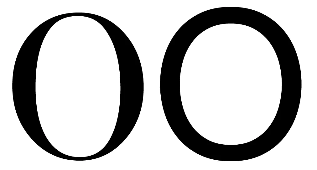 Both of these glyphs have some contrast. The glyph on the left has much greater contrast than the glyph on the right — notice how the stroke gets much thinner at the top of the “O” when compared with the sides.
Contrast is typically thought of as how the weight of the font looks, but not necessarily how it measures out to be. There are no “rules” about certain weights corresponding to contrast levels, it’s all about the rules of perception.
Angle of contrast
In the image below, we can see that thin parts of the letter “O” land on different axes. In the glyph on the left, we can see that the thin part is on a perfectly vertical axis, but on the right the axis is diagonal.
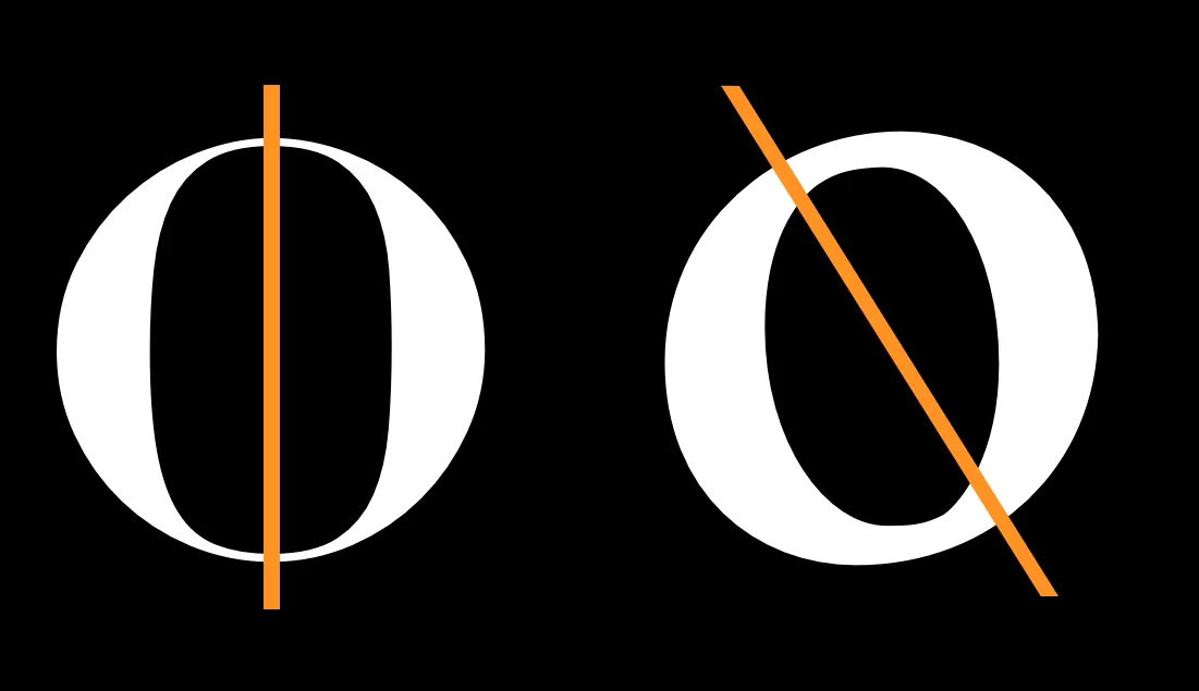
This is angle of contrast.
Weight distribution
This pertains to fonts with contrast specifically. If your font does not utilize contrast, then this doesn’t really apply, as weight distribution is equal throughout the stroke.
Aka, how the thickness is proportioned throughout a stroke.
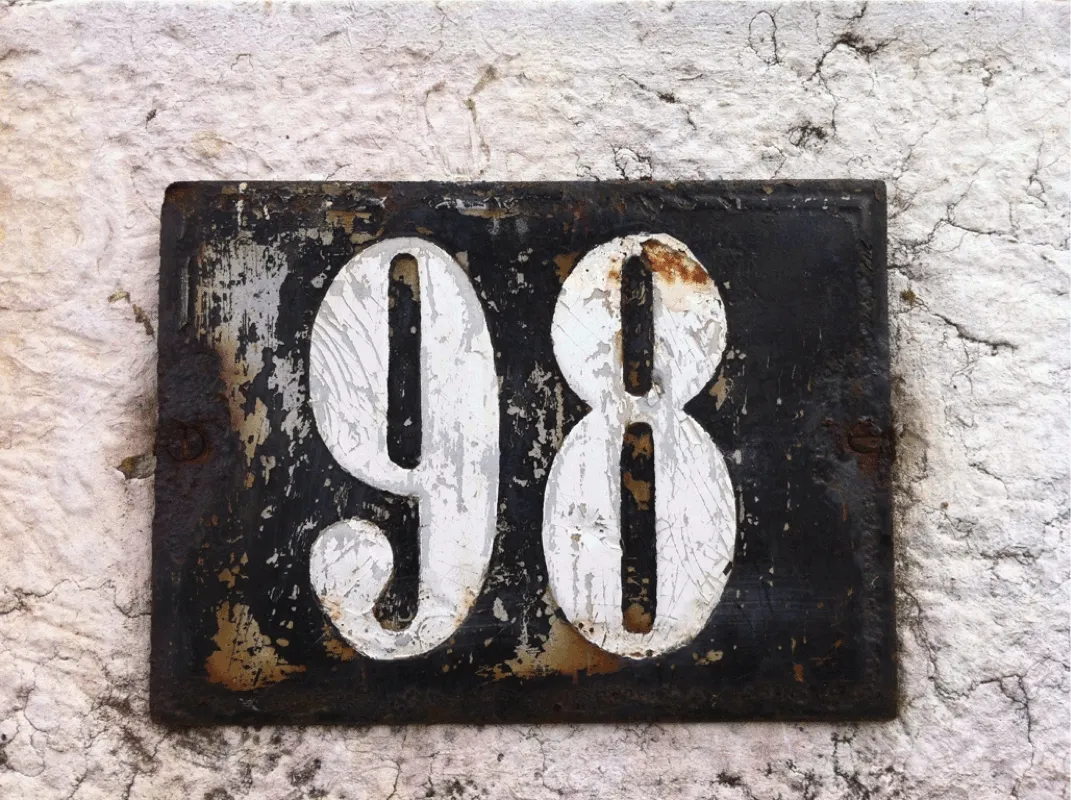
The 9 and 8 above are a particularly intense example of vertical weight distribution.
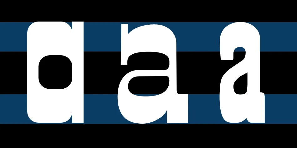
This is an example of horizontal weight distribution, which is much less common.
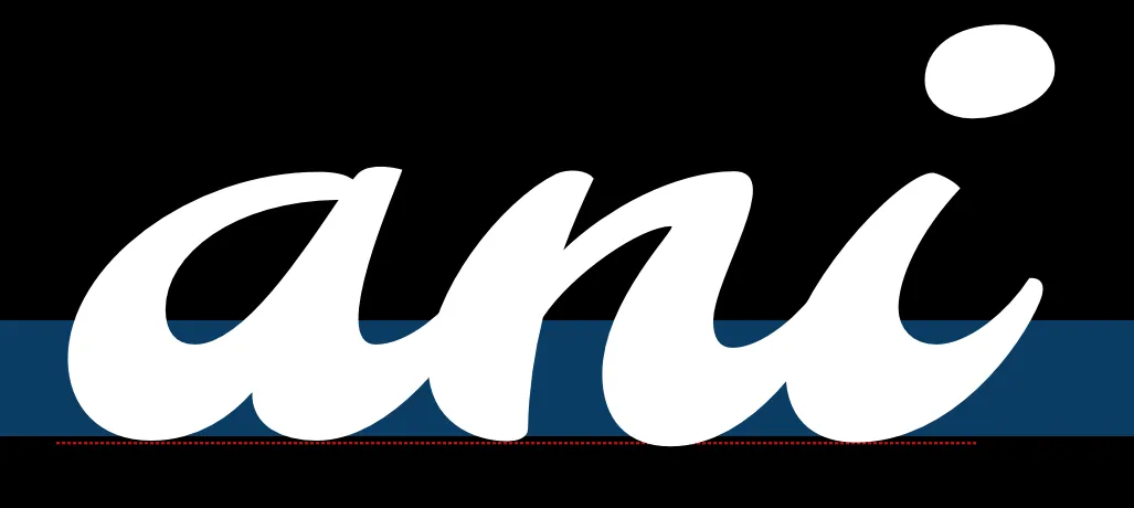 This one is botttom heavy.
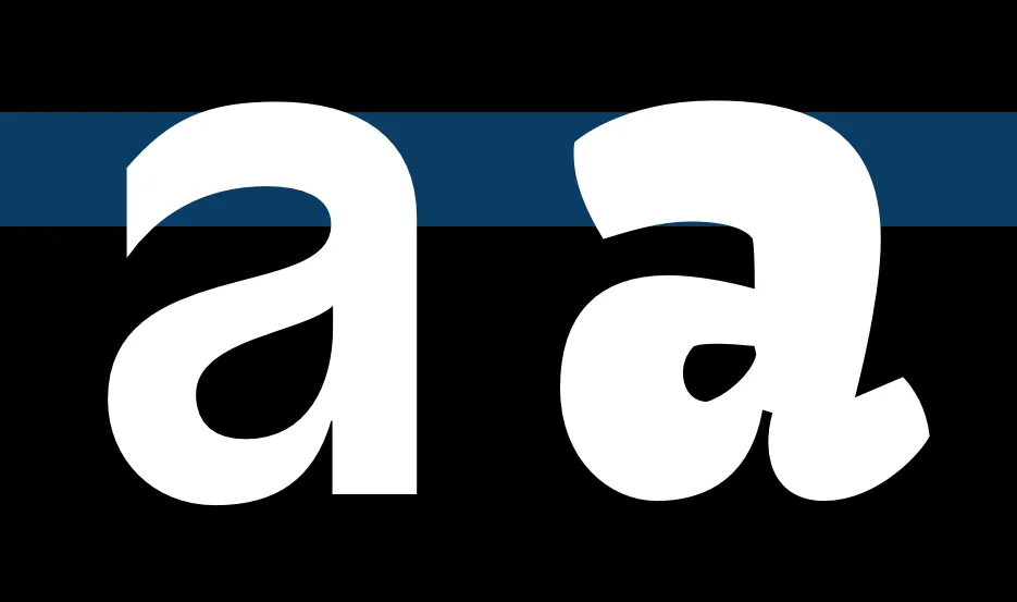 This one is top heavy.
Joins
Joins are this part of a glyph, circled in orange:
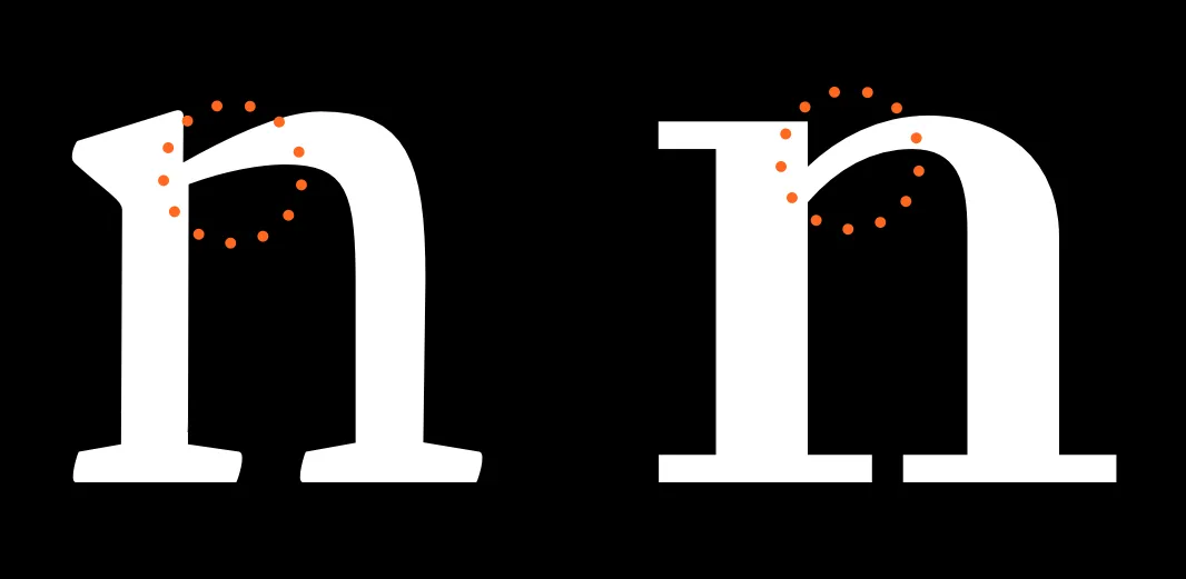
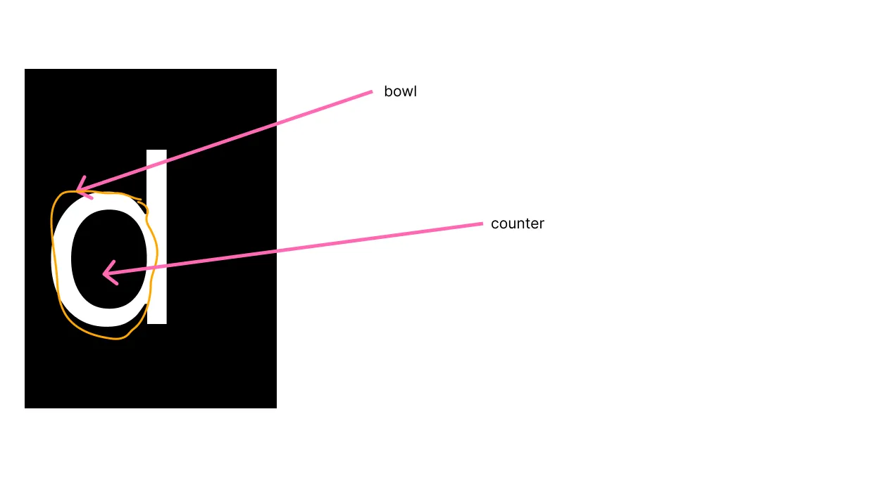
Bowls & Counters
See below. The “bowl” is the stroke itself, while the “counter” is the empty arrow contained within.
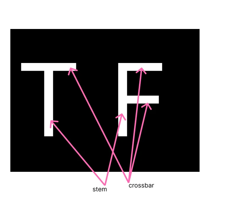
Stems & Crossbars
See below. Not that stems are not necessarily straight.
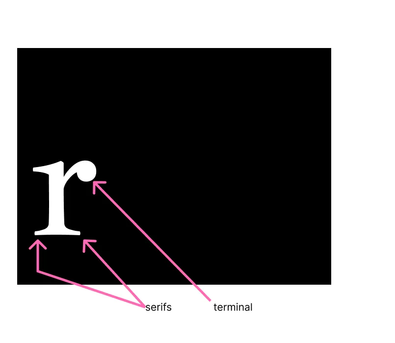
Serifs & Terminals
TERMINALS ARE NOT THE SAME AS SERIFS. Terminals are the end forms of the strokes. Terminals are often perpendicular to the angle of the stroke at its end. They’re kind of meant to to evoke/mimic the mark-making tool or nib (pointy tip of the pen) that one would use when
Speed, Regularity, Flourish
These are all a bit more subjective but my attempt:
- Speed: if the font looks very italic, or like it was written fast, it has high speed.
- Regularity: how similar all of the glyphs look
- Flourish: This has a lot of flourish
Brackets
A bracket is a part of a serif font. It’s different from terminals, different from serifs.
The brackets are the curved or angled connection between the serif and the main stroke of the glyph. It’s the smooth transition that softens the join between a serif and a glyph’s stem or crossbar.
Brackets with smooth/curved connections are also referred to as “adnate serifs”. Brackets with angled connections are referred to as “abrupt serifs”. Adnate and abrupt.
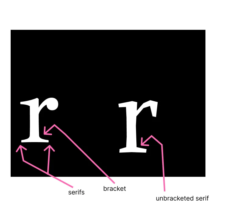
Typefaces with bracketed serifs (left, Jacques Francois) have a softer, more traditional appearance, while those without brackets (called unbracketed serifs, e.g., Alike Angular on the right) have a more abrupt and geometric look.
 Last modified:
  Last modified: