Balancing Shapes
The discipline of typography is keenly aware of the discrepancy between true geometric shape and the way the human eye perceives shape.
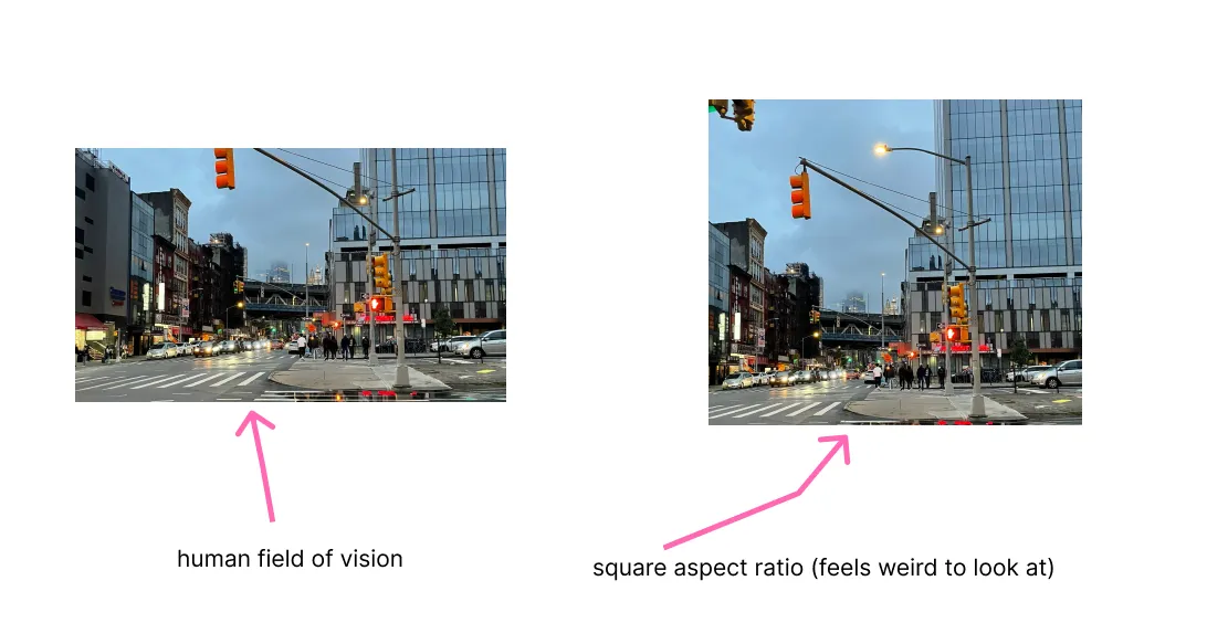
The human field of vision is (said to be) more horizontal than it is vertical. We’re all basically walking around with landscape mode goggles on all the time, though we might not really realize it.

As far as I have learned so far, this affects us in primarily two areas: center and weight.

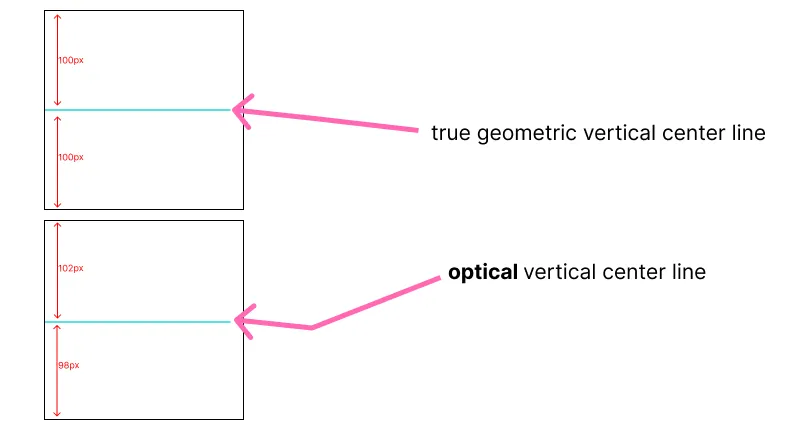
What we see as the vertical center is, in fact, different from the actual geometric center. The “optical center” that humans prefer is actually slightly below the true geometric center (on a vertical axis).
Additionally, we see horizontal lines as thicker in weight (heavier) than vertical lines. Diagonal lines are less thick than horizontal lines but still optically thicker/heavier than vertical lines.
Type designers are constantly working to compensate for these visual discrepancies — walking that subjective line to create things that feel visually centered. Or, in some cases, working off of that concept of visually centered to create something that is slightly visually off-kilter, or playing off that “center”.
The 8, for example, you would think it’s symmetrical, right? Wrong. A symmetrical 8 looks weird af.
For example, letters like H, h, b, 8 — the bowl is usually not hugging the vertical center, but slightly below it.
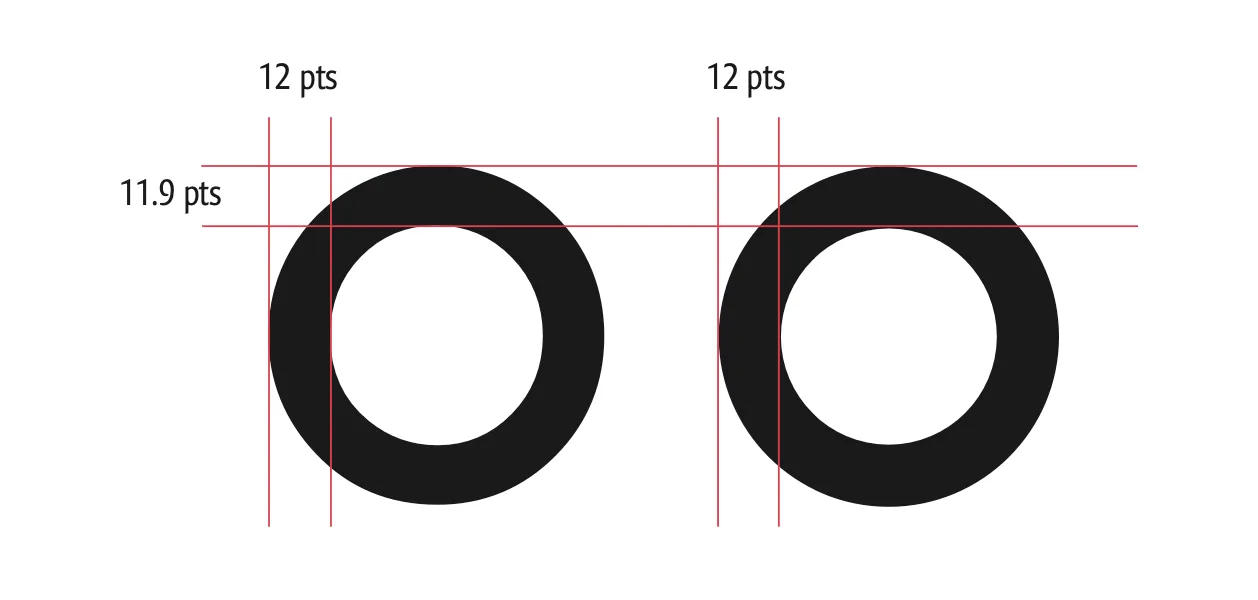
Similarly, letters like O in a monoline font like Century Gothic, are not, in fact, composed of a monoline. There is some slight contrast in order to give the optical perception of a line of even thickness, giving a bit more weight to the vertical part of the stroke and slightly thinning the horizontal part of the stroke.

In the above image, the O on the left is Century gothic, note the compensation on vertical vs. horizontal parts of the stroke. On the right is a “true” monoline O — a circle with consistent weight throughout the stroke.
See also: The Poggendorff illusion
TLDR: human perception of size and perception of center are different from actual geometric center and size.
 Last modified:
  Last modified: